
Campaign concept · Design leadership2015
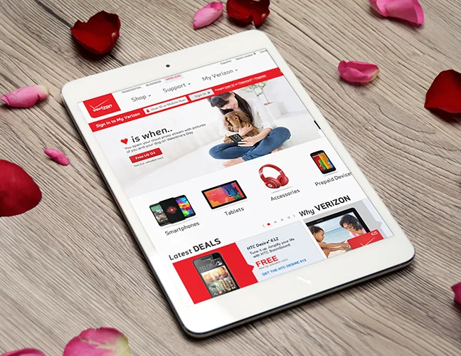
Love is when
A Valentine’s campaign that broadened the story from romantic gifts to the ways technology connects friends and family.
Not every visitor arrives knowing which device they want. I designed an Apple product landing page that gave broader brand traffic a useful starting point, introducing iPhone and iPad products with clear visual hierarchy.
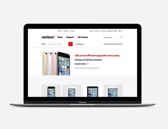
Visitors interested in Apple who have not yet chosen a specific device.
Help broad brand interest become a more informed product choice.
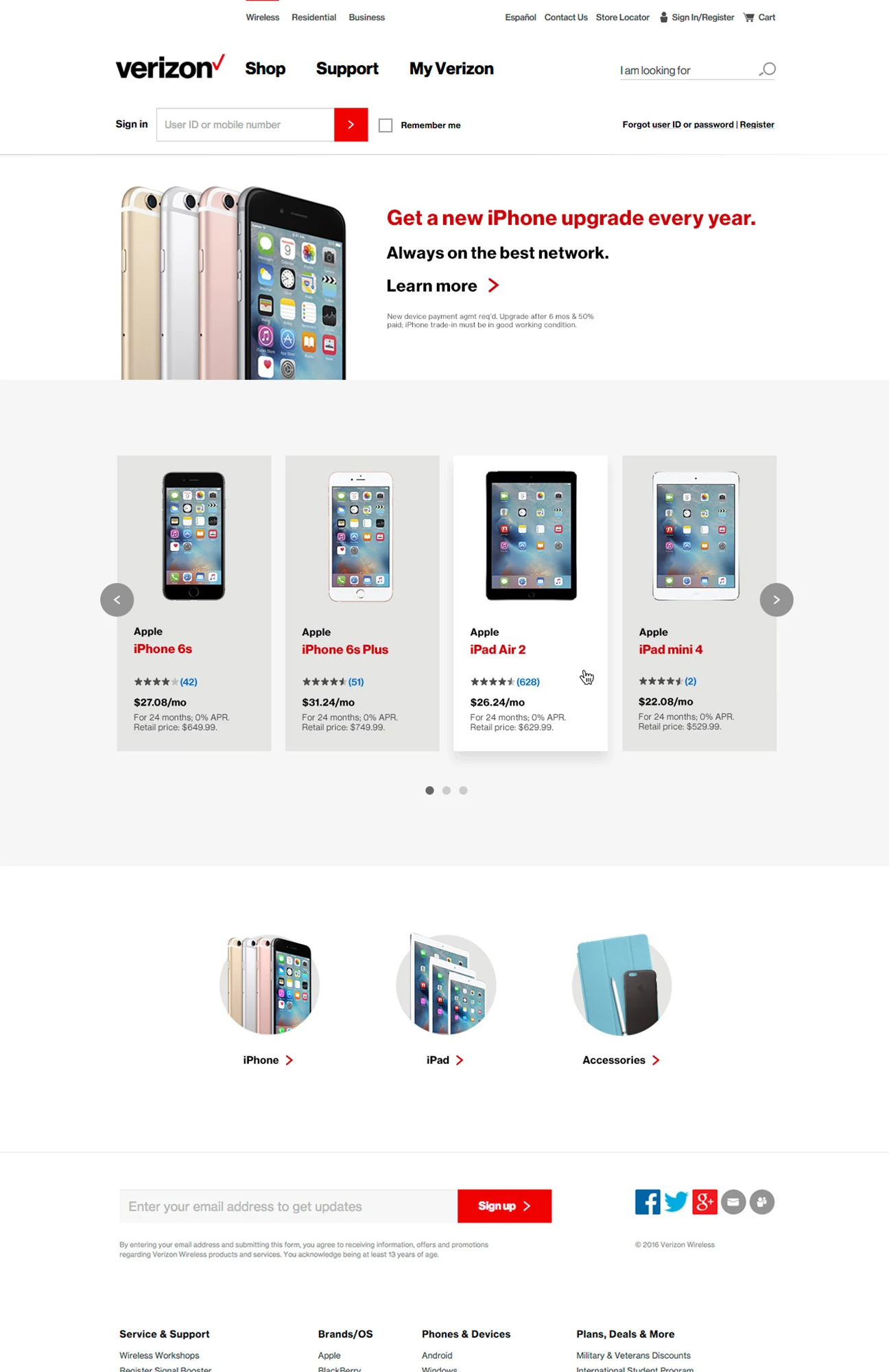
An Apple product landing-page design presenting iPhone and iPad options.
The page brought product information together in one destination for visitors who had not yet selected a device. Brief descriptions and focused product imagery introduced the options and encouraged further exploration.
Consistent white space helped separate the product stories and make the content easier to scan. The design aimed to offer enough information for the next decision without turning the landing page into a full product-detail experience.
The work shows how visual hierarchy can support decision-making. Product grouping and space help establish where to start before a customer moves into the detail of an individual device.
Original project materials reflect the product interfaces and brand guidelines at the time. This overview describes my design contribution; it does not claim unreported business or conversion results.
A Valentine’s campaign that broadened the story from romantic gifts to the ways technology connects friends and family.
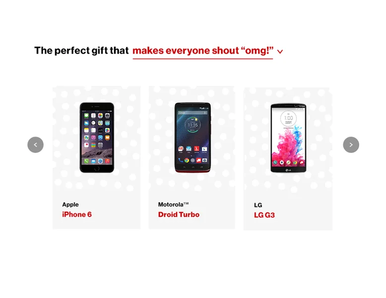
A seasonal homepage exploration using a personalized carousel and a subtle snow interaction.
UX leadership, practical AI, and thoughtful digital experiences.