
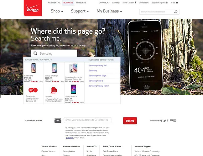
Error recovery · UX/UI concept
A more helpful 404
Three error-page concepts that paired a recognizable visual idea with supportive language and routes back into the site.
An order confirmation is the beginning of the next part of a customer’s experience. This redesign explored how Verizon’s confirmation and receipt pages could provide essential information, set expectations and help customers prepare for their purchase to arrive.
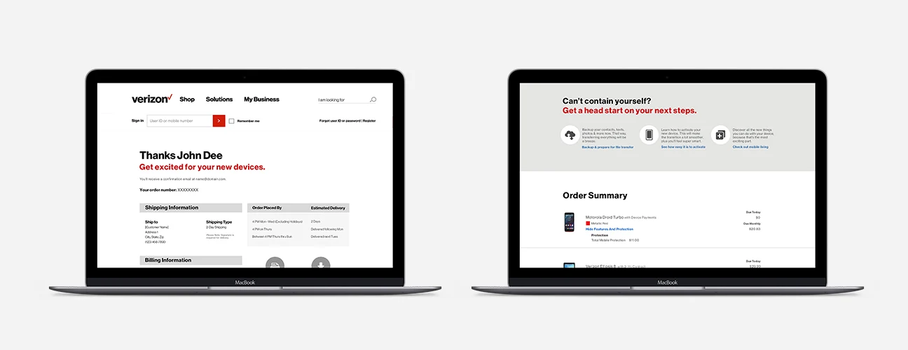
Customers who have completed a purchase and need to understand what happens next.
Make confirmation information useful beyond the transaction itself.
Confirmation and receipt-page design explorations within Verizon’s brand system.
The brief prioritized self-service, account registration and customer satisfaction, with reduced support calls as a business goal. Those objectives guided a simpler, more personalized confirmation experience; they are project goals rather than reported results.
The proposed content combined essential purchase information with practical guidance about the item. Links to product-related editorial content offered a way to learn about a device before delivery.
The work explored a common confirmation and receipt layout aligned with Verizon’s updated brand identity. The archive shows the progression through initial ideas, treatment options and the resulting design presentation.
This work treats the moment after checkout as part of the customer journey. It connects transaction information with preparation and product understanding, rather than ending the experience at the purchase.
Original project materials reflect the product interfaces and brand guidelines at the time. This overview describes my design contribution; it does not claim unreported business or conversion results.
Three error-page concepts that paired a recognizable visual idea with supportive language and routes back into the site.
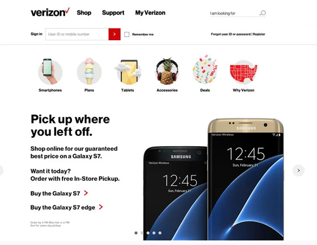
A messaging experiment comparing an offer, urgency and a simpler service benefit for returning customers.
UX leadership, practical AI, and thoughtful digital experiences.