
Personalization · Test design
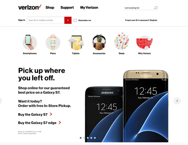
Returning-shopper messaging
A messaging experiment comparing an offer, urgency and a simpler service benefit for returning customers.
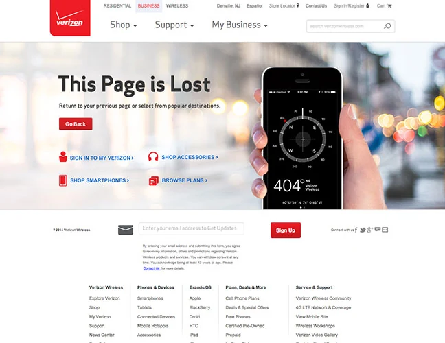
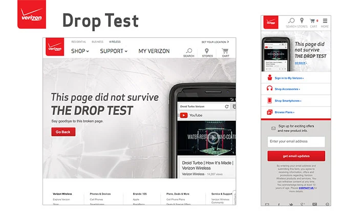
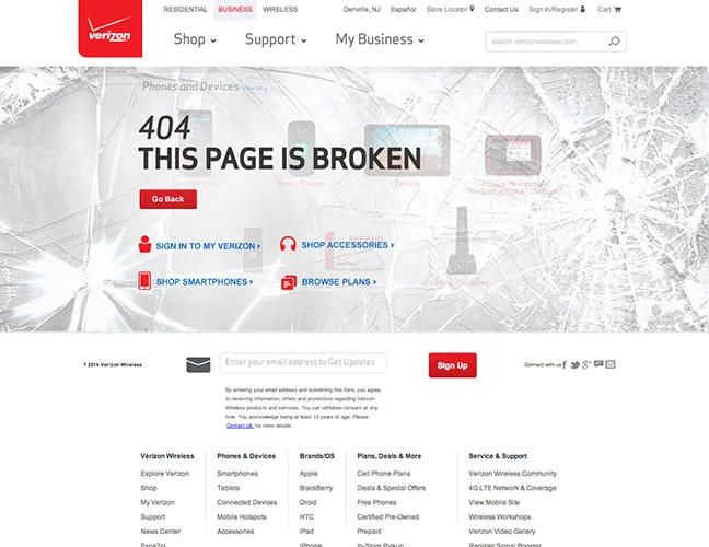
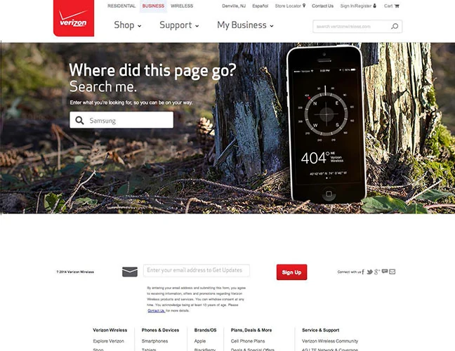
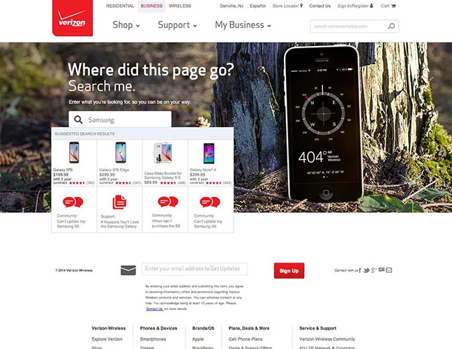
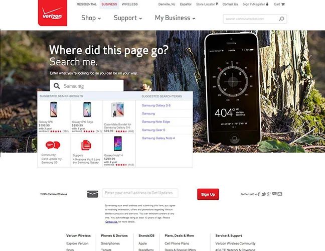
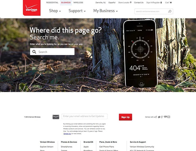
A missing page should help people recover, not leave them at a dead end. Working with a copywriter, I explored three Verizon 404 concepts that added personality while keeping navigation and reassuring language central to the experience.
Visitors who reach a missing or unavailable page.
Turn an interruption into a clear next step without blaming the customer.
Three error-page concepts developed with a copywriter; the project was withdrawn before launch.
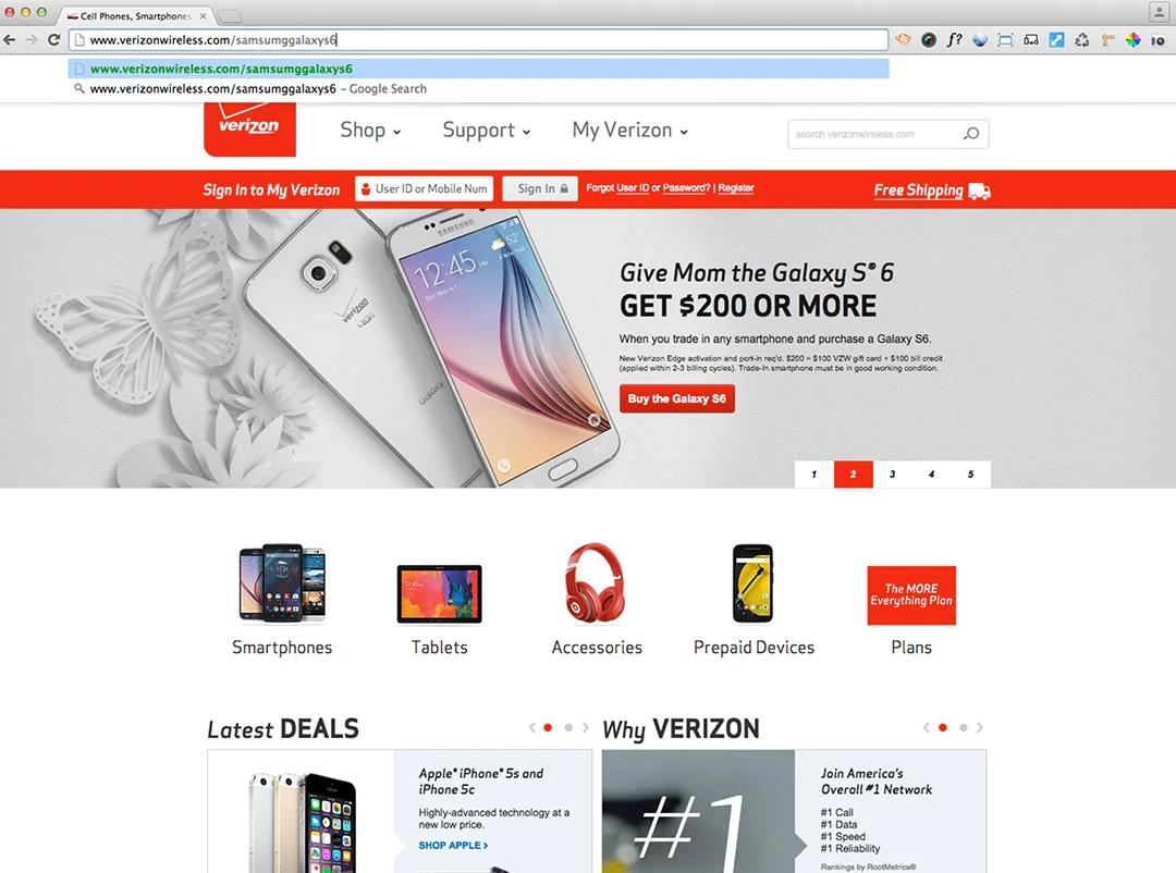
We researched existing error-page approaches, then developed our own visual directions. The copy avoided suggesting the customer had done something wrong, while useful links offered a way back to familiar destinations.
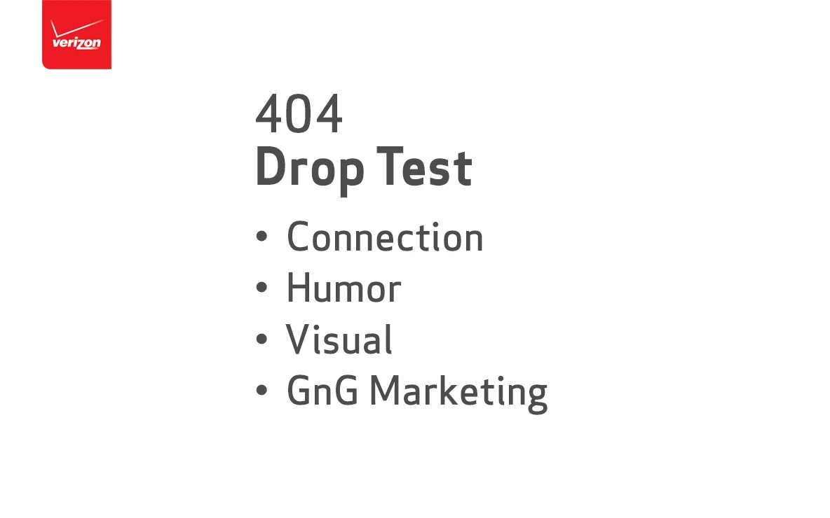
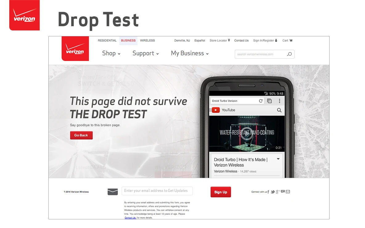
The Compass concept used a familiar navigation metaphor. Drop Test contrasted a surviving phone with a broken page, while Shattered Screen applied the error directly to the site’s visual interface.
The work was withdrawn before launch when the style guide changed. It remains a design exploration of error recovery, visual storytelling and collaboration between interface design and copy.
Even a small utility page needs a considered user experience. These concepts combine tone, navigation, and visual hierarchy to help someone recover from a wrong turn.
Original project materials reflect the product interfaces and brand guidelines at the time. This overview describes my design contribution; it does not claim unreported business or conversion results.
A messaging experiment comparing an offer, urgency and a simpler service benefit for returning customers.
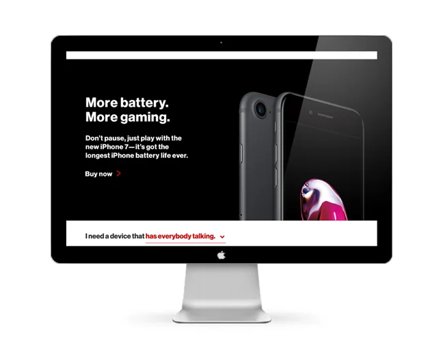
Feature-led messaging concepts that connect a phone’s capabilities with different customer interests.
UX leadership, practical AI, and thoughtful digital experiences.